
Consulting
Marketing
Design


Diyooo – revolutionizing the taste of everyday refreshment.
Client
diyooo
 India
India
Services
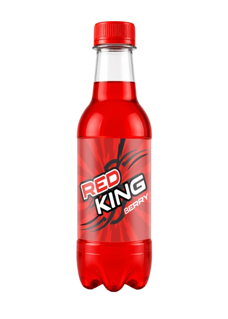
Diyooo needed to earn the loyalty of a young generation tired of generic, dated soda brands—while instantly standing out on crowded retail shelves dominated by legacy giants.
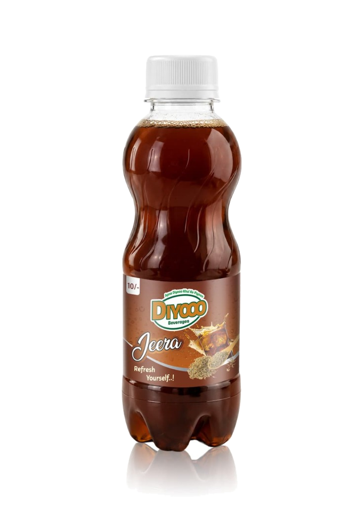
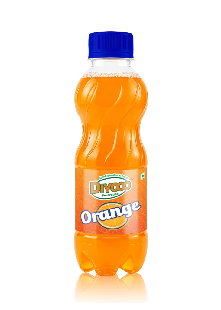
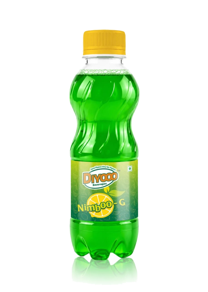
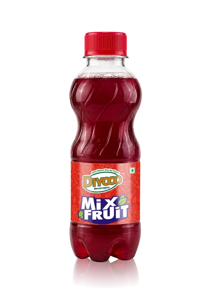
The mission was to craft a vibrant packaging and brand identity that truly resonates with today’s youth. Visually striking, appetite-inducing, and unapologetically bold, the design had to embody the brand's core spirit: encouraging consumers to drink fearlessly (“Khul Ke Piyooo”).
Our Role
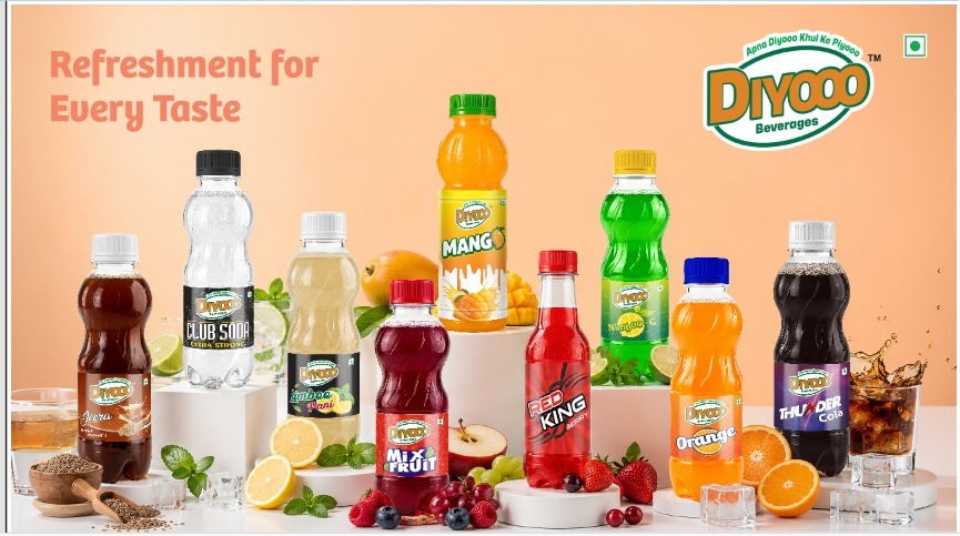
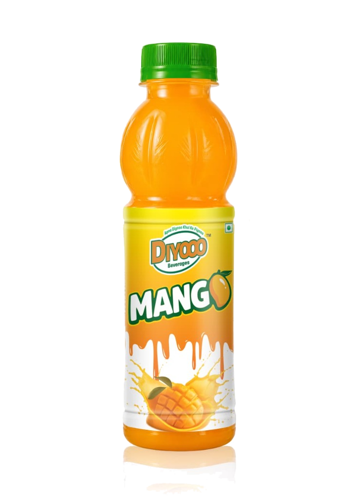
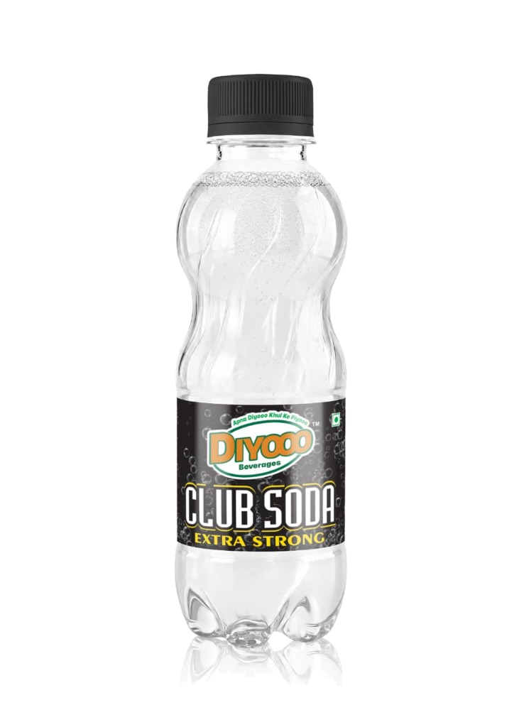
Our role was an end-to-end packaging and visual identity design across Diyooo’s multi-flavor beverage lineup—ensuring high shelf-appeal, distinct flavor differentiation, and cohesive brand recognition in a competitive FMCG market.
The central challenge was building a versatile design system. Each flavor—from Thunder Cola and Red King to classic Mango, Orange, and Jeera—needed its own unique personality and punch without breaking the overarching brand language. The result is a bold, shelf-popping identity that captures instant consumer attention while keeping each flavor clear, enticing, and instantly recognizable.

#UX and UI Audit #Product packaging designing #Brandkit #Web development #Branding
tattvva the pure essence of nutrition
tattvva
India
India
Results
100% Pure & Natural Sourcing
Custom packaging & shelf presence
Designed for daily family nutrition
#Product packaging designing #Web development #UX and UI audit #Branding #Brandkit
GO-VIZ real fruit fun
GO-VIZ
India
India
Results
80+ restaurants and retail outlets actively selling
Strategic brand partnership with Saktrix
Custom packaging and product design
#Branding #Product packaging designing
Satine – building a trusted identity for high-quality acrylic distemper, delivering smooth, washable, crack-resistant, and long-lasting wall solutions.
Satine
India
India
Results
Sharper positioning
Unified design
Stronger appeal